
这是一篇专门用来验收主题能力的长文章
这篇文章不是普通随笔,而是用来集中验证当前文章页是否已经真正接近安知鱼主题阅读体验的一次总检。它会同时覆盖 文章头图扫描、分类与标签识别、目录层级映射、代码块增强、GFM 表格与任务列表、隐藏内容、特殊字体与格式、媒体展示、内容块组合 与 长段落滚动表现。
如果这些能力能够在同一篇文章里稳定出现,而且目录、分享、评论、侧栏、打赏与整体阅读路径都没有散架,那么这套主题才算真的进入可交付阶段。
基础格式扫描
先用一段基础文本确认最常见的 Markdown 语义已经稳定可读:
- 这里有 加粗文本,用来确认正文强调不会过亮也不会糊掉。
- 这里有 斜体文本,用来确认正文节奏不被打断。
- 这里有
删除线,用于检查 GFM 扩展是否已经生效。 - 这里有
inline code,用于确认行内代码块边距、圆角和字号。 - 这里有 外部链接到 Astro,用于确认链接色和 hover 反馈。
这一段还会刻意混入中文、英文、数字与符号,例如 Astro 6 + React 19 + Tailwind 4,以便确认字距和换行在真实长文里不会显得拥挤。
特殊格式与特殊字体
下面这些项目不是普通博客每天都会写到的内容,但它们非常适合拿来测试文章系统是否具备足够完整的表达能力:
<mark>高亮文本</mark>用来测试重点标记。<kbd>Ctrl</kbd> + <kbd>K</kbd>用来测试快捷键表现。<ruby>目录<rt>mulu</rt></ruby>用来测试注音排版。<abbr title="Application Programming Interface">API</abbr>用来测试缩略词解释。- 行内上标示例:E = mc2。
- 行内下标示例:H2O 与 logn。
还可以直接插入一段带有不同字体的原生 HTML:
This sentence uses a serif rhythm.
const typographyMode = "editorial + geek";
这一块同时覆盖 高亮标记、键位、`inline code`、不同字重与原生 HTML,目的是确认正文增强不是只在单一内容形态下成立。
隐藏内容与剧透
当前主题已经支持几种前端增强型的内联内容:
- 剧透遮罩:||这是一段会在点击后显示的剧透文本,用来确认按钮化遮罩已经正确扫描。||
- 直接点击显示:%%这里是一段隐藏提示,点击后会展开。%%
这一层现在只保留前端可见性增强,不再提供“前端密码隐藏”这种容易被误认为安全能力的写法。真正需要密码访问时,应使用文章 frontmatter 里的服务端访问控制。
如果这一段的两个交互都正常,说明正文增强脚本已经与 Markdown 渲染保持一致,没有把普通文本节点误伤到 code、pre 或其他受保护元素。
目录层级压测
这一节专门用于验证目录的层级压缩方案是不是已经同时满足了两个目标:
- 层级关系必须准确,不能把 H4 伪装成 H2。
- 缩进不能过大,否则目录会因为留白太多而失去实际可点击性。
第一层分组:信息结构
当目录真正贴近文章结构时,读者并不需要逐字阅读标题,也能大致判断这一段内容是总论、子论点,还是补充项。目录的任务不是“把所有标题抄一遍”,而是帮助读者建立文章地图。
第二层分组:层级线索
如果目录完全没有缩进,那么所有标题就会挤在同一条水平线上,读者很难一眼分辨哪个标题属于哪个部分。反过来,如果每一层都用过大的缩进,目录又会迅速失去点击效率。
第二层分组:跳转效率
真正可用的方案,通常不是继续扩大缩进,而是在小缩进基础上增加路径高亮、活动分支标记、激活项背景与编号提示,让层级关系和操作效率同时成立。
第一层分组:阅读路径
这一段用来测试另一种常见场景:读者先从上往下扫目录,然后停在某个 H3,最后直接点击跳转到正文中部。
第二层分组:当前定位
当前定位区域如果能稳定显示活动标题、当前层级与总序号,就能显著提升长文阅读时的方向感。
第二层分组:目录滚动
当活动标题切换时,目录列表自身也应该保持跟随,但不能在用户手动滚动目录时强行抢回焦点。
第一层分组:极端长文
如果文章足够长,目录仍然需要保持固定可用,而不是因为卡片高度策略错误直接失去 sticky 行为。
第二层分组:H4 密度测试
这一段后面会继续补一批 H4,目的是让目录出现更明显的深层节点,进一步观察压缩缩进是否仍然可读。
第三层补充:H5 路径压缩
这一层用来确认目录在继续深入时,不会因为层级增加就把可点击区域压缩得过窄。也就是说,层级变深,不代表交互面积可以变小。
第四层末级:H6 锚点试验
如果你在右侧目录里仍然能看清这一级的位置,而且点击后锚点跳转准确、当前路径高亮稳定,那么更深一级的标题扫描就已经补齐了。
第二层分组:额外节点 A
这里是额外节点 A,用于制造更长的目录列表。
第二层分组:额外节点 B
这里是额外节点 B,用于制造更长的目录列表。
第二层分组:额外节点 C
这里是额外节点 C,用于制造更长的目录列表。
列表、任务和表格
下面这组内容主要验证 GFM 扩展是否已经完整接入。
无序列表与有序列表
- 首页结构优先。
- 文章页目录优先。
- 评论区应该保持直观。
- 先看目录是否可靠。
- 再看分享与打赏是否顺手。
- 最后看评论区是否真的可发布。
任务列表
- 头图与元信息扫描
- 标签与分类聚合
- 目录层级修正
- 打赏与分享结构整改
- 接入真实远端评论数据
- 补足更多安知鱼式内容标签
表格
| 模块 | 当前目标 | 验收标准 |
|---|---|---|
| 首页分类卡 | 对齐安知鱼动效 | 图标角度、放大策略和 hover 节奏一致 |
| TOC | 层级准确且不失可点性 | H2/H3/H4 可辨识,活动路径明确 |
| 打赏弹层 | 只展示有效信息 | 区域选择 + 二维码,且自动避让视口 |
| 分享工具 | 真正对应不同平台 | 不只是复制链接,而是生成对应分享内容 |
| 评论区 | 可直接发布 | 纵向排布、固定高度、滚动浏览公开评论 |
引用、折叠块和长代码
一个成熟的博客主题,不应该只在截图里看起来像样,而应该在真实长文里持续稳定地工作。
这段引用主要测试 blockquote 的层级感和正文节奏是否合适。
点击展开折叠块,检查 summary/details 是否已经有可读样式
折叠块非常适合放二级说明、补充材料和临时附注。这里故意放成原生 HTML,而不是主题私有标签,目的是保持 Markdown 内容本身的可迁移性。
如果你以后把文章系统从本地 Markdown 切到 API 或 CMS,这类标准 HTML 结构会比主题私有短代码更稳。
TypeScript 代码块
type TocNode = {
  id: string;
  depth: 2 | 3 | 4;
  title: string;
  children: TocNode[];
};

export function compressTocIndent(nodes: TocNode[], offset = 0): TocNode[] {
  return nodes.map((node) => ({
    ...node,
    children: compressTocIndent(node.children, offset + 1),
  }));
}

const sharePayload = {
  title: "安知鱼式主题对齐",
  summary: "把目录、分享、评论与打赏的真实使用路径一起补齐。",
  platforms: ["wechat", "weibo", "x", "telegram", "email"],
};
Bash 代码块
npm install
npm run build
npm run preview -- --host 0.0.0.0
CSS 代码块
#card-toc .toc-item {
  padding-left: calc(var(--toc-level, 0) * 12px);
}

#card-toc .toc-item.is-active-branch > .toc-link {
  background: color-mix(in srgb, var(--theme-main) 10%, var(--card-bg));
}

.post-share-grid__surface {
  display: inline-flex;
  align-items: center;
  gap: 8px;
}
图片、分割线与脚注
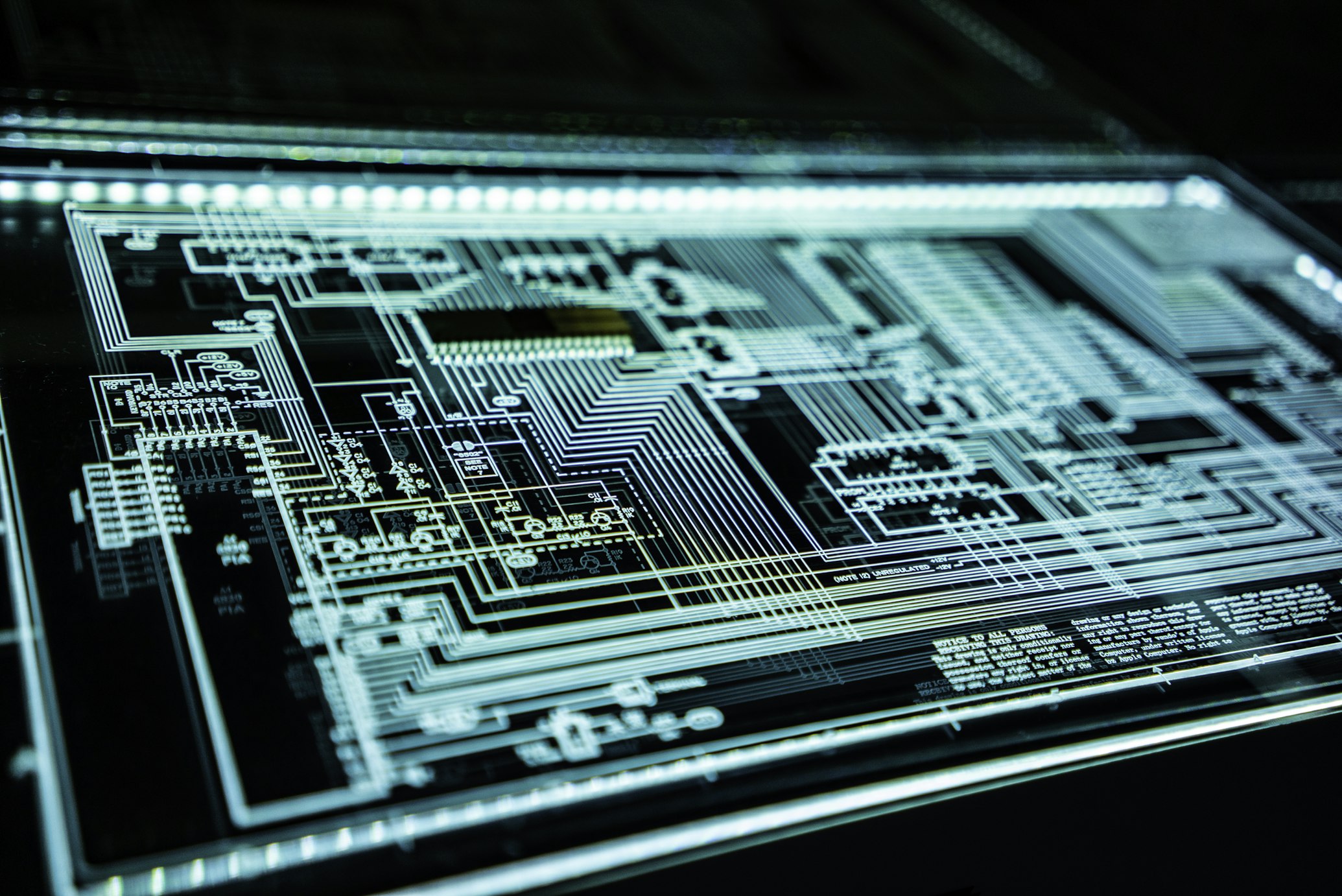
下面这张图片主要用来确认正文图片在长文中不会超出文章宽度,并且与上下文保持稳定的留白关系。

脚注也是长文很常见的结构,现在用它来测试 GFM 脚注能力是否已经生效。1
媒体与嵌入补充
如果要把这篇文章当成主题总检,还需要把正文里的媒体块一起压一遍:

如果远程资源失效,正文增强脚本会把它们回退到默认占位图,而不是留下破损空框。
常见内容块等价演示
这一节不再只测基础 Markdown,而是补齐一些日常博客主题里最常见、也最容易在迁移时丢失的内容块。这里使用原生 HTML 和当前主题样式做等价演示,重点验证排版、间距和响应式,而不是绑定某个旧主题的私有语法。

长段落滚动压测
真正的问题通常不会出现在一篇很短的演示文里,而会出现在一篇足够长、包含多种模块、又带目录与悬浮工具的文章里。因此这里故意补两段更长的正文,来测试滚动时文章头图后的内容衔接、正文呼吸感、侧栏 sticky、目录活动项、打赏区与评论区之间的阅读落差是否仍然稳定。
一个稳定的文章页,不应该要求用户理解组件结构、技术栈或交互动机。用户真正感受到的只有三件事:第一,我能不能快速找到我想看的段落;第二,当我准备分享、打赏或评论时,这些入口是不是在我需要的时候刚好出现,而不是大面积打断正文;第三,当文章已经很长、目录节点很多、评论也在继续增长时,这个页面还能不能维持秩序。只要这三件事成立,主题就已经从“看起来像一个主题”变成“真正可以长期使用的内容系统”。
最后再补一段更偏作者视角的总结:对齐安知鱼主题并不意味着把每一行模板照搬过来,而是把它那些已经被长期使用验证过的设计判断重新理解一遍,然后在 Astro 体系里用更适合当前工程结构的方式复现出来。真正值得复刻的不是旧技术栈,而是它对信息优先级、交互反馈、阅读路径和模块秩序的判断力。如果这些判断已经在这篇文章里被完整验证,那么这次对齐工作才算真正进入了可以交付的阶段。
Footnotes
-
这里的脚注文本会被放到文章底部,用来验证脚注编号、跳转和正文间距。 ↩
Dies ist ein langer Artikel, der speziell zur Überprüfung der Themenfähigkeit dient
Dieser Artikel ist kein gewöhnlicher Essay, sondern ein umfassender Test, ob die aktuelle Artikelseite bereits das Leseerlebnis des Anzhi‑Yu‑Themes wirklich erreicht hat. Er deckt gleichzeitig Artikel‑Header‑Bild‑Scan, Kategorien‑ und Tag‑Erkennung, Verzeichnis‑Ebenen‑Mapping, Code‑Block‑Verbesserungen, GFM‑Tabellen‑ und Aufgabenlisten, versteckten Inhalt, spezielle Schriftarten‑ und Formatierungen, Medien‑Anzeige, Kombination von Inhaltsblöcken und Scroll‑Verhalten langer Absätze ab.
Wenn diese Fähigkeiten in einem einzigen Artikel stabil auftreten und Verzeichnis, Teilen, Kommentare, Seitenleiste, Spenden und der gesamte Lesepfad nicht zusammenbrechen, dann gilt das Theme als wirklich lieferbereit.
Basis‑Format‑Scan
Zuerst ein kurzer Basis‑Text, um zu bestätigen, dass die gängigsten Markdown‑Semantiken stabil und lesbar sind:
- Hier gibt es fetten Text, um zu prüfen, dass Hervorhebungen nicht zu grell und nicht zu verblasst sind.
- Hier gibt es kursiven Text, um zu prüfen, dass der Lesefluss nicht unterbrochen wird.
- Hier gibt es
Durchgestrichenen Text, um zu prüfen, ob die GFM‑Erweiterung bereits wirkt. - Hier gibt es
inline code, um Rand, Rundungen und Schriftgröße von Inline‑Code‑Blöcken zu prüfen. - Hier gibt es einen externen Link zu Astro, um Link‑Farbe und Hover‑Feedback zu prüfen.
Dieser Abschnitt mischt bewusst Chinesisch, Englisch, Zahlen und Symbole, z. B. Astro 6 + React 19 + Tailwind 4, um Abstand und Zeilenumbruch in langen Texten zu testen.
Spezielle Formate und Schriftarten
Die folgenden Elemente kommen nicht in jedem Blog vor, eignen sich aber hervorragend, um zu prüfen, ob das System über ausreichende Ausdrucksfähigkeit verfügt:
<mark>Hervorgehobener Text</mark>zum Testen von Hervorhebungen.<kbd>Ctrl</kbd> + <kbd>K</kbd>zum Testen von Tastenkombinationen.<ruby>Inhaltsverzeichnis<rt>mulu</rt></ruby>zum Testen von Ruby‑Annotationen.<abbr title="Application Programming Interface">API</abbr>zum Testen von Abkürzungs‑Erklärungen.- Beispiel für hochgestellten Inline‑Text: E = mc2.
- Beispiel für tiefgestellten Inline‑Text: H2O und logn.
Es kann auch ein Abschnitt mit nativen HTML‑Elementen und unterschiedlichen Schriftarten eingefügt werden:
This sentence uses a serif rhythm.
const typographyMode = "editorial + geek";
Dieser Block deckt gleichzeitig Hervorgehobene Markierung, Tastaturtaste, `inline code`, verschiedene Schriftgewichte und nativen HTML‑Code ab, um zu bestätigen, dass die Text‑Verbesserungen nicht nur für eine einzelne Inhaltsform gelten.
Versteckter Inhalt und Spoiler
Das aktuelle Theme unterstützt mehrere front‑end‑verbesserte Inline‑Inhalte:
- Spoiler‑Overlay: ||Dies ist ein Spoiler‑Text, der nach einem Klick angezeigt wird, um zu bestätigen, dass das buttonbasierte Overlay korrekt erkannt wurde.||
- Direktes Klicken zum Anzeigen: %%Dies ist ein versteckter Hinweis, der nach einem Klick ausgeklappt wird.%%
Diese Ebene bietet jetzt nur noch Front‑End‑Sichtbarkeits‑Verbesserungen und verzichtet auf „Front‑End‑Passwort‑Versteckungen“, die leicht fälschlicherweise als Sicherheitsfunktion missverstanden werden könnten. Für echte passwortgeschützte Zugriffe sollte die serverseitige Zugriffskontrolle im Frontmatter des Artikels verwendet werden.
Wenn beide Interaktionen in diesem Abschnitt korrekt funktionieren, bedeutet das, dass das Text‑Verbesserungsskript mit der Markdown‑Render‑Engine synchronisiert ist und keine normalen Textknoten fälschlicherweise in code, pre oder andere geschützte Elemente umgewandelt werden.
Stresstest der Verzeichnis‑Ebenen
Dieser Abschnitt dient ausschließlich dazu, zu prüfen, ob das Komprimierungs‑Schema für das Verzeichnis gleichzeitig zwei Ziele erfüllt:
- Die Ebenen‑Beziehung muss exakt sein; ein H4 darf nicht als H2 maskiert werden.
- Die Einrückung darf nicht zu groß sein, sonst verliert das Verzeichnis durch zu viel Leerraum an Klick‑Usability.
Erste Ebene Gruppe: Informationsstruktur
Wenn das Verzeichnis die Artikelstruktur exakt widerspiegelt, muss der Leser nicht jeden Titel Wort für Wort lesen, um zu erkennen, ob ein Abschnitt ein Hauptthema, ein Unterpunkt oder eine Ergänzung ist. Die Aufgabe des Verzeichnisses ist nicht, „alle Überschriften zu kopieren“, sondern dem Leser eine Karte des Artikels zu bieten.
Zweite Ebene Gruppe: Ebenen‑Hinweise
Fehlt jede Einrückung, stapeln sich alle Überschriften auf einer horizontalen Linie, sodass der Leser kaum erkennen kann, welcher Titel zu welchem Abschnitt gehört. Umgekehrt führt zu viel Einrückung dazu, dass das Verzeichnis schnell an Klick‑Effizienz verliert.
Zweite Ebene Gruppe: Sprung‑Effizienz
Eine wirklich brauchbare Lösung vergrößert nicht einfach die Einrückung, sondern ergänzt bei kleinen Einrückungen Pfad‑Hervorhebungen, aktive Zweig‑Markierungen, Hintergrund‑Highlights und Nummerierungs‑Hinweise, sodass Ebenen‑Beziehung und Bedien‑Effizienz gleichzeitig erfüllt werden.
Erste Ebene Gruppe: Lesepfad
Dieser Abschnitt testet ein weiteres gängiges Szenario: Der Leser scannt das Verzeichnis von oben nach unten, bleibt bei einem H3 stehen und klickt dann direkt zum Mittelteil des Haupttexts.
Zweite Ebene Gruppe: Aktuelle Position
Wenn der aktuelle Bereich stabil die aktive Überschrift, die aktuelle Ebene und die Gesamtnummer anzeigt, erhöht das deutlich das Orientierungsempfinden beim Lesen langer Texte.
Zweite Ebene Gruppe: Verzeichnis‑Scrollen
Beim Wechsel der aktiven Überschrift sollte die Verzeichnis‑Liste selbst folgen, jedoch nicht den Fokus zurückerobern, wenn der Nutzer das Verzeichnis manuell scrollt.
Erste Ebene Gruppe: Extrem lange Texte
Bei sehr langen Artikeln muss das Verzeichnis weiterhin fest und nutzbar bleiben, anstatt durch falsche Karten‑Höhen‑Strategien das Sticky‑Verhalten zu verlieren.
Zweite Ebene Gruppe: H4‑Dichte‑Test
Im Anschluss folgen weitere H4‑Überschriften, um tiefere Knoten im Verzeichnis deutlicher sichtbar zu machen und zu beobachten, ob die komprimierte Einrückung weiterhin lesbar bleibt.
Dritte Ebene Ergänzung: H5‑Pfad‑Komprimierung
Diese Ebene bestätigt, dass das Verzeichnis bei weiterer Tiefe nicht die klickbare Fläche zu stark verkleinert. Mehr Ebenen bedeutet nicht, dass die Interaktionsfläche kleiner werden darf.
Vierte Ebene Endstufe: H6‑Anker‑Test
Wenn du in der rechten Seitenleiste das H6‑Element noch klar erkennen kannst und nach dem Klick der Anker‑Sprung exakt und die Pfad‑Hervorhebung stabil bleibt, ist die Erfassung tieferer Überschriften vollständig abgeschlossen.
Zweite Ebene Gruppe: Zusätzlicher Knoten A
Hier ist ein zusätzlicher Knoten A, um die Verzeichnis‑Liste weiter zu verlängern.
Zweite Ebene Gruppe: Zusätzlicher Knoten B
Hier ist ein zusätzlicher Knoten B, um die Verzeichnis‑Liste weiter zu verlängern.
Zweite Ebene Gruppe: Zusätzlicher Knoten C
Hier ist ein zusätzlicher Knoten C, um die Verzeichnis‑Liste weiter zu verlängern.
Listen, Aufgaben und Tabellen
Der folgende Abschnitt prüft hauptsächlich, ob die GFM‑Erweiterungen vollständig integriert sind.
Ungeordnete und geordnete Listen
- Priorität der Startseiten‑Struktur.
- Priorität des Artikel‑Verzeichnis.
- Der Kommentarbereich sollte intuitiv bleiben.
- Zuerst prüfen, ob das Verzeichnis zuverlässig ist.
- Dann prüfen, ob Teilen und Spenden reibungslos funktionieren.
- Abschließend prüfen, ob der Kommentarbereich tatsächlich Beiträge zulässt.
Aufgabenliste
- Header‑Bild‑ und Metadaten‑Scan
- Tag‑ und Kategorien‑Aggregation
- Verzeichnis‑Ebenen‑Korrektur
- Struktur‑Überarbeitung für Spenden und Teilen
- Integration echter Remote‑Kommentar‑Daten
- Ergänzung weiterer Anzhi‑Yu‑spezifischer Inhalts‑Tags
Tabelle
| Modul | Aktuelles Ziel | Abnahmekriterien |
|---|---|---|
| Startseiten‑Kategorie‑Karte | Anpassung an Anzhi‑Yu‑Animation | Icon‑Winkel, Vergrößerungsstrategie und Hover‑Rhythmus sind konsistent |
| Inhaltsverzeichnis | Hierarchie ist exakt und bleibt anklickbar | H2/H3/H4 erkennbar, aktive Pfade klar |
| Spenden‑Popup | Nur relevante Informationen anzeigen | Bereichsauswahl + QR‑Code, automatisch viewport‑optimiert |
| Teilen‑Tool | Echt passend für verschiedene Plattformen | Nicht nur Link kopieren, sondern passende Share‑Inhalte generieren |
| Kommentarbereich | Direktes Veröffentlichen möglich | Vertikale Anordnung, feste Höhe, scrollbare Ansicht öffentlicher Kommentare |
Zitate, ausklappbare Blöcke und langer Code
Ein reifes Blog‑Theme sollte nicht nur auf Screenshots gut aussehen, sondern in langen, echten Artikeln stabil und kontinuierlich funktionieren.
Dieses Zitat testet hauptsächlich das Gefühl der Blockquote‑Hierarchie und ob das Rhythmus des Fließtextes passend ist.
Klicken Sie, um den ausklappbaren Block zu öffnen und prüfen Sie, ob summary/details bereits lesbare Stile besitzen
Ausklappbare Blöcke eignen sich hervorragend für sekundäre Erklärungen, ergänzendes Material und temporäre Anmerkungen. Hier bewusst als reines HTML eingefügt, nicht als themenspezifisches Tag, um die Portabilität des Markdown‑Inhalts zu erhalten.
Wenn Sie das Artikelsystem später von lokalem Markdown zu einer API oder einem CMS wechseln, sind solche standardisierten HTML‑Strukturen stabiler als themenspezifische Shortcodes.
TypeScript‑Codeblock
type TocNode = {
  id: string;
  depth: 2 | 3 | 4;
  title: string;
  children: TocNode[];
};

export function compressTocIndent(nodes: TocNode[], offset = 0): TocNode[] {
  return nodes.map((node) => ({
    ...node,
    children: compressTocIndent(node.children, offset + 1),
  }));
}

const sharePayload = {
  title: "安知鱼式主题对齐",
  summary: "把目录、分享、评论与打赏的真实使用路径一起补齐。",
  platforms: ["wechat", "weibo", "x", "telegram", "email"],
};
Bash‑Codeblock
npm install
npm run build
npm run preview -- --host 0.0.0.0
CSS‑Codeblock
#card-toc .toc-item {
  padding-left: calc(var(--toc-level, 0) * 12px);
}

#card-toc .toc-item.is-active-branch > .toc-link {
  background: color-mix(in srgb, var(--theme-main) 10%, var(--card-bg));
}

.post-share-grid__surface {
  display: inline-flex;
  align-items: center;
  gap: 8px;
}
Bilder, Trennlinien und Fußnoten
Die folgende Abbildung dient dazu, zu prüfen, dass Bilder im Fließtext nicht die Artikelbreite überschreiten und einen stabilen Abstand zum Kontext behalten.
Fußnoten sind in langen Texten ebenfalls üblich; hier testen wir, ob GFM‑Fußnoten korrekt funktionieren. 1
Medien und Einbettungszusätze
Wenn dieser Artikel als Gesamttest für das Theme dient, sollten auch die Medienelemente im Text geprüft werden:
Wenn Remote‑Ressourcen ausfallen, wird das Text‑Verbesserungsskript sie durch ein Standard‑Platzhalterbild ersetzen, anstatt leere, kaputte Rahmen zu hinterlassen.
Demonstration äquivalenter gängiger Inhaltsblöcke
Dieser Abschnitt testet nicht mehr nur grundlegendes Markdown, sondern ergänzt einige der am häufigsten vorkommenden und bei einer Migration am leichtesten zu verlierenden Inhaltsblöcke in täglichen Blog‑Themen. Hier wird mit nativem HTML und den aktuellen Theme‑Stilen eine äquivalente Demonstration durchgeführt, wobei der Fokus auf Layout, Abstand und Responsivität liegt und nicht auf der Bindung an proprietäre Syntax eines alten Themes.
Langer Absatz‑Scroll‑Stresstest
Das eigentliche Problem tritt selten in einem sehr kurzen Demonstrationsartikel auf, sondern in einem ausreichend langen Beitrag, der verschiedene Module, ein Inhaltsverzeichnis und schwebende Werkzeuge enthält. Deshalb werden hier bewusst zwei längere Absätze ergänzt, um zu testen, ob nach dem Header‑Bild die Inhalte beim Scrollen nahtlos anschließen, das Text‑„Atmen“, die sticky Sidebar, aktive Verzeichniseinträge, der Spenden‑ und Kommentarbereich weiterhin stabil bleiben.
Eine stabile Artikelseite sollte den Nutzer nicht zwingen, die Komponentenstruktur, den Technologie‑Stack oder die Interaktions‑Motivation zu verstehen. Was der Nutzer wirklich wahrnimmt, sind drei Dinge: Erstens, ob er schnell den gewünschten Abschnitt finden kann; zweitens, ob die Eingänge zum Teilen, Spenden oder Kommentieren genau dann erscheinen, wenn er sie braucht, ohne den Text großflächig zu unterbrechen; drittens, ob die Seite bei sehr langen Artikeln, vielen Verzeichnis‑Knoten und wachsenden Kommentaren weiterhin Ordnung bewahrt. Sobald diese drei Punkte erfüllt sind, hat das Theme den Status von „sieht aus wie ein Theme“ zu „wirklich langfristig nutzbares Content‑System“ gewechselt.
Abschließend noch ein aus der Autoren‑Perspektive formulierter Ausblick: Das Angleichen des AnZhiYu‑Themes bedeutet nicht, jede Zeile Vorlage eins zu eins zu übernehmen, sondern die bewährten Design‑Entscheidungen, die über lange Zeit validiert wurden, neu zu interpretieren und im Astro‑Ökosystem auf eine Weise zu reproduzieren, die besser zur aktuellen Projektstruktur passt. Was wirklich nachgeahmt werden sollte, ist nicht der alte Technologie‑Stack, sondern das Urteilsvermögen hinsichtlich Informations‑Priorität, Interaktions‑Feedback, Lesepfade und Modul‑Ordnung. Wenn diese Urteile in diesem Artikel vollständig verifiziert wurden, gilt die Angleich‑Arbeit als tatsächlich lieferbereit.
Footnotes
-
Dieser Fußnotentext wird am Ende des Artikels platziert, um Fußnotennummerierung, Sprungmarken und Abstand zum Fließtext zu überprüfen. ↩
This is a long article specifically for testing theme capabilities
This article is not a regular essay, but a comprehensive check to verify whether the current article page truly approaches the An Zhiyu theme reading experience. It will simultaneously cover article hero image scanning, category and tag recognition, directory hierarchy mapping, code block enhancement, GFM tables and task lists, hidden content, special fonts and formats, media display, content block combination, and long paragraph scrolling performance.
If these capabilities can consistently appear in the same article, and the table of contents, sharing, comments, sidebar, tipping, and overall reading path do not fall apart, then this theme can truly be considered in a deliverable stage.
Basic Format Scan
First, use a basic text to confirm that the most common Markdown semantics are stable and readable:
- Here is bold text to confirm that body text emphasis is neither too bright nor blurry.
- Here is italic text to confirm that the body text rhythm is not interrupted.
- Here is
strikethroughto check if GFM extensions are active. - Here is
inline codeto confirm inline code block margins, rounded corners, and font size. - Here is an external link to Astro to confirm link color and hover feedback.
This paragraph will also deliberately mix Chinese, English, numbers, and symbols, such as Astro 6 + React 19 + Tailwind 4, to ensure that character spacing and line breaks do not appear cramped in a real long article.
Special Formats and Special Fonts
The following items are not content that ordinary blogs write daily, but they are very suitable for testing whether the article system has sufficiently complete expressive capabilities:
<mark>高亮文本</mark>is used to test highlight marking.<kbd>Ctrl</kbd> + <kbd>K</kbd>is used to test keyboard shortcut performance.<ruby>目录<rt>mulu</rt></ruby>is used to test furigana typesetting.<abbr title="Application Programming Interface">API</abbr>is used to test acronym explanations.- Inline superscript example: E = mc2.
- Inline subscript example: H2O and logn.
You can also directly insert a block of native HTML with different fonts:
This sentence uses a serif rhythm.
const typographyMode = "editorial + geek";
This section simultaneously covers highlighting, keybinds, `inline code`, different font weights, and native HTML, aiming to confirm that body text enhancements are not limited to a single content form.
Hidden Content and Spoilers
The current theme already supports several front-end enhanced inline content types:
- Spoiler Mask: ||This is a spoiler text that will be displayed after clicking, used to confirm that the buttonized mask has been correctly scanned.||
- Click to Show: %%This is a hidden hint that will expand after clicking.%%
This layer now only retains front-end visibility enhancements and no longer provides “front-end password hiding,” a method easily mistaken for a security feature. When true password access is required, server-side access control in the article’s frontmatter should be used.
If both interactions in this section are normal, it indicates that the body text enhancement script is consistent with Markdown rendering and has not mistakenly affected plain text nodes like code, pre, or other protected elements.
Table of Contents Hierarchy Stress Test
This section is specifically for verifying whether the table of contents’ hierarchy compression scheme has simultaneously met two objectives:
- Hierarchy must be accurate; H4s cannot be disguised as H2s.
- Indentation should not be excessive, otherwise the table of contents will lose practical clickability due to too much whitespace.
First-level Grouping: Information Structure
When the table of contents truly aligns with the article’s structure, readers don’t need to read titles word-for-word to roughly determine if a section is a general overview, a sub-point, or an addendum. The task of the table of contents is not to “copy all titles,” but to help readers build an article map.
Second-level Grouping: Hierarchy Clues
If the table of contents has no indentation at all, all titles will be crammed onto the same horizontal line, making it difficult for readers to quickly distinguish which title belongs to which section. Conversely, if each level uses excessive indentation, the table of contents will quickly lose click efficiency.
Second-level Grouping: Jump Efficiency
A truly usable solution typically doesn’t involve further increasing indentation, but rather adding path highlighting, active branch markers, active item backgrounds, and numbering hints on top of small indentations, allowing both hierarchical relationships and operational efficiency to coexist.
First-level Grouping: Reading Path
This section is used to test another common scenario: readers scan the table of contents from top to bottom, then stop at a certain H3, and finally click directly to jump to the middle of the body text.
Second-level Grouping: Current Position
If the current positioning area can stably display the active title, current level, and total sequence number, it can significantly improve the sense of direction when reading long articles.
Second-level Grouping: Table of Contents Scrolling
When the active title switches, the table of contents list itself should also follow, but it should not forcibly regain focus when the user manually scrolls the table of contents.
First-level Grouping: Extremely Long Article
If the article is long enough, the table of contents should remain fixed and available, rather than losing its sticky behavior due to an incorrect card height strategy.
Second-level Grouping: H4 Density Test
This section will be supplemented with more H4s later, aiming to create more prominent deep-level nodes in the table of contents and further observe if compressed indentation remains readable.
Third-level Supplement: H5 Path Compression
This level is used to confirm that as the table of contents goes deeper, the clickable area does not become too narrow due to increased nesting. In other words, deeper levels do not mean smaller interactive areas.
Fourth-level Terminal: H6 Anchor Test
If you can still clearly see the position of this level in the right-hand table of contents, and after clicking, the anchor jump is accurate and the current path highlighting is stable, then the scanning for deeper-level headings has been completed.
Second-level Grouping: Extra Node A
This is extra node A, used to create a longer table of contents list.
Second-level Grouping: Extra Node B
This is extra node B, used to create a longer table of contents list.
Second-level Grouping: Extra Node C
This is extra node C, used to create a longer table of contents list.
Lists, Tasks, and Tables
The following set of content primarily verifies whether GFM extensions have been fully integrated.
Unordered Lists and Ordered Lists
- Homepage structure first.
- Article page table of contents first.
- The comment section should remain intuitive.
- First, check if the table of contents is reliable.
- Next, check if sharing and tipping are convenient.
- Finally, check if comments can actually be published.
Task List
- Header Image and Meta Information Scan
- Tag and category aggregation
- Table of Contents hierarchy correction
- Tipping and sharing structure overhaul
- Integrate real remote comment data
- Supplement more Anzhiyu-style content tags
Table
| Module | Current Goal | Acceptance Criteria |
|---|---|---|
| Homepage Category Cards | Align with Anzhiyu’s animations | Consistent icon angle, zoom strategy, and hover rhythm |
| TOC | Accurate hierarchy and maintains clickability | H2/H3/H4 are distinguishable, clear active path |
| Tipping Pop-up | Only display valid information | Area selection + QR code, and automatically avoids viewport |
| Sharing Tools | Truly corresponds to different platforms | Not just copying links, but generating corresponding sharing content |
| Comment Section | Directly publishable | Vertical layout, fixed height, scroll to browse public comments |
Quotes, collapsible blocks, and long code
A mature blog theme should not only look good in screenshots, but also work consistently and stably in real long-form articles.
This quote primarily tests whether the hierarchy and rhythm of the blockquote are appropriate for the main text.
Click to expand the collapsible block and check if summary/details already have a readable style
Collapsible blocks are very suitable for secondary explanations, supplementary materials, and temporary notes. They are intentionally placed here as native HTML, rather than theme-specific tags, to maintain the portability of the Markdown content itself.
If you later switch your article system from local Markdown to an API or CMS, these standard HTML structures will be more stable than theme-specific shortcodes.
TypeScript Code Block
type TocNode = {
  id: string;
  depth: 2 | 3 | 4;
  title: string;
  children: TocNode[];
};

export function compressTocIndent(nodes: TocNode[], offset = 0): TocNode[] {
  return nodes.map((node) => ({
    ...node,
    children: compressTocIndent(node.children, offset + 1),
  }));
}

const sharePayload = {
  title: "安知鱼式主题对齐",
  summary: "把目录、分享、评论与打赏的真实使用路径一起补齐。",
  platforms: ["wechat", "weibo", "x", "telegram", "email"],
};
Bash Code Block
npm install
npm run build
npm run preview -- --host 0.0.0.0
CSS Code Block
#card-toc .toc-item {
  padding-left: calc(var(--toc-level, 0) * 12px);
}

#card-toc .toc-item.is-active-branch > .toc-link {
  background: color-mix(in srgb, var(--theme-main) 10%, var(--card-bg));
}

.post-share-grid__surface {
  display: inline-flex;
  align-items: center;
  gap: 8px;
}
Images, Horizontal Rules, and Footnotes
The image below is mainly used to confirm that images in the main text do not exceed the article width in long-form content, and maintain a consistent spacing relationship with the surrounding context.
Footnotes are also a common structure in long-form articles. We are now using them to test if GFM footnote capabilities are active. 1
Media and Embeds Supplement
If this article is to be used as a comprehensive theme check, the media blocks within the main text also need to be thoroughly reviewed:
If remote resources fail, the main text enhancement script will revert them to default placeholder images instead of leaving broken empty frames.
Common Content Block Equivalence Demonstration
This section no longer just tests basic Markdown, but rather complements some of the most common content blocks in daily blog themes that are also most easily lost during migration. Here, native HTML and the current theme’s styles are used for an equivalent demonstration, focusing on verifying typography, spacing, and responsiveness, rather than binding to a specific old theme’s private syntax.
Long Paragraph Scrolling Stress Test
The real issues usually don’t appear in a short demo article, but in a sufficiently long article that contains multiple modules, a table of contents, and floating tools. Therefore, we deliberately add two longer sections of body text here to test, during scrolling, whether the content transition after the article’s header image, the breathing of the main text, the sticky sidebar, the active items in the table of contents, and the reading gap between the reward area and the comments section remain stable.
A stable article page should not require users to understand component structures, tech stacks, or interaction motives. Users actually perceive only three things: first, whether they can quickly find the paragraph they want to read; second, whether the entry points for sharing, rewarding, or commenting appear precisely when needed, without large interruptions to the main text; third, whether the page can maintain order when the article is long, the table of contents has many nodes, and comments continue to grow. As long as these three conditions are met, the theme shifts from “looks like a theme” to “a content system that can be used long‑term.”
Finally, a summary from the author’s perspective: aligning the Anzhiyu theme does not mean copying every line of the template verbatim, but rather re‑examining the design judgments that have been validated through long‑term use, and reproducing them within the Astro ecosystem in a way that better fits the current project structure. What truly deserves replication is not the old tech stack, but its judgment regarding information hierarchy, interaction feedback, reading flow, and module ordering. If these judgments have been fully validated in this article, then this alignment work can truly be considered ready for delivery.
Footnotes
-
The footnote text here will be placed at the bottom of the article to verify footnote numbering, jumps, and main text spacing. ↩
Este es un artículo largo diseñado específicamente para validar las capacidades del tema
Este artículo no es una entrada de blog convencional, sino una inspección general destinada a verificar si la página de artículos actual se ha acercado verdaderamente a la experiencia de lectura del tema Anzhiyu. Cubrirá simultáneamente el escaneo de la imagen de cabecera, la identificación de categorías y etiquetas, el mapeo de la jerarquía de la tabla de contenidos, la mejora de los bloques de código, las tablas GFM y listas de tareas, el contenido oculto, las fuentes y formatos especiales, la presentación de medios, la combinación de bloques de contenido y el rendimiento del desplazamiento en párrafos largos.
Si estas capacidades aparecen de manera estable en un mismo artículo, y si la tabla de contenidos, el compartir, los comentarios, la barra lateral, las propinas y la ruta de lectura general no se desintegran, entonces este tema habrá entrado realmente en la fase de entregabilidad.
Escaneo de formatos básicos
Primero, usemos un texto básico para confirmar que las semánticas de Markdown más comunes son estables y legibles:
- Aquí hay texto en negrita, para confirmar que el énfasis en el cuerpo del texto no sea demasiado brillante ni borroso.
- Aquí hay texto en cursiva, para confirmar que el ritmo del texto no se interrumpa.
- Aquí hay
texto tachado, para verificar si la extensión GFM ya está activa. - Aquí hay
código en línea, para confirmar los márgenes, las esquinas redondeadas y el tamaño de fuente de los bloques de código en línea. - Aquí hay un enlace externo a Astro, para confirmar el color del enlace y la retroalimentación al pasar el cursor (hover).
Este párrafo también mezcla deliberadamente chino, inglés, números y símbolos, por ejemplo Astro 6 + React 19 + Tailwind 4, para confirmar que el espaciado entre letras y los saltos de línea no parezcan abarrotados en un artículo largo real.
Formatos y fuentes especiales
Los siguientes elementos no son contenido que se escriba a diario en un blog normal, pero son muy adecuados para probar si el sistema de artículos tiene una capacidad de expresión lo suficientemente completa:
<mark>texto resaltado</mark>para probar la marca de énfasis.<kbd>Ctrl</kbd> + <kbd>K</kbd>para probar la representación de los atajos de teclado.<ruby>目录<rt>mulu</rt></ruby>para probar la tipografía con anotaciones fonéticas.<abbr title="Application Programming Interface">API</abbr>para probar la explicación de las siglas.- Ejemplo de superíndice en línea: E = mc2.
- Ejemplo de subíndice en línea: H2O y logn.
También se puede insertar directamente un fragmento de HTML nativo con diferentes fuentes:
This sentence uses a serif rhythm.
const typographyMode = "editorial + geek";
Este bloque cubre simultáneamente marcas de resaltado, teclas, `código en línea`, diferentes pesos de fuente y HTML nativo, con el objetivo de confirmar que la mejora del cuerpo del texto no es válida solo bajo una única forma de contenido.
Contenido oculto y spoilers
El tema actual ya soporta varios tipos de contenido en línea con mejoras de front-end:
- Máscara de spoiler: ||Este es un texto de spoiler que se mostrará tras hacer clic, para confirmar que la máscara botoneada se ha escaneado correctamente.||
- Mostrar al hacer clic directamente: %%Aquí hay una pista oculta que se desplegará tras hacer clic.%%
Esta capa ahora solo mantiene la mejora de visibilidad del front-end y ya no ofrece la escritura de “ocultación por contraseña de front-end”, que es una capacidad de seguridad que se suele malinterpretar. Cuando se necesite realmente acceso por contraseña, se debe utilizar el control de acceso del servidor en el frontmatter del artículo.
Si ambas interacciones de este párrafo funcionan correctamente, significa que el script de mejora del cuerpo del texto está en línea con la renderización de Markdown y no ha dañado accidentalmente nodos de texto comunes, code, pre u otros elementos protegidos.
Prueba de estrés de la jerarquía de la tabla de contenidos
Esta sección está diseñada específicamente para verificar si el esquema de compresión de niveles de la tabla de contenidos cumple simultáneamente dos objetivos:
- Las relaciones jerárquicas deben ser precisas; no se debe disfrazar un H4 como un H2.
- La sangría no debe ser excesiva, de lo contrario la tabla de contenidos perderá su clicabilidad práctica debido al exceso de espacio en blanco.
Primer nivel de agrupación: Estructura de la información
Cuando la tabla de contenidos se ajusta realmente a la estructura del artículo, el lector no necesita leer los títulos palabra por palabra para poder determinar aproximadamente si el contenido de esa sección es una introducción general, un subargumento o un elemento complementario. La tarea de la tabla de contenidos no es “copiar todos los títulos”, sino ayudar al lector a construir un mapa del artículo.
Segundo nivel de agrupación: Pistas de jerarquía
Si la tabla de contenidos no tiene sangría en absoluto, todos los títulos se apretarán en la misma línea horizontal, lo que dificultará que el lector distinga de un vistazo a qué parte pertenece cada título. Por el contrario, si cada nivel utiliza una sangría excesiva, la tabla de contenidos perderá rápidamente su eficiencia de clic.
Segundo nivel de agrupación: Eficiencia de salto
La solución realmente utilizable normalmente no consiste en seguir ampliando la sangría, sino en añadir sobre una base de sangría pequeña el resaltado de la ruta, la marca de la rama activa, el fondo del elemento activado y las indicaciones de numeración, para que las relaciones jerárquicas y la eficiencia operativa se mantengan simultáneamente.
Primer nivel de agrupación: Ruta de lectura
Este párrafo sirve para probar otro escenario común: el lector primero barre la tabla de contenidos de arriba hacia abajo, luego se detiene en un H3 y finalmente hace clic directamente para saltar al medio del cuerpo del texto.
Segundo nivel de agrupación: Posicionamiento actual
Si el área de posicionamiento actual puede mostrar de manera estable el título activo, el nivel actual y el número de serie total, se mejorará significativamente la orientación durante la lectura de artículos largos.
Segundo nivel de agrupación: Desplazamiento de la tabla de contenidos
Cuando cambia el título activo, la propia lista de la tabla de contenidos también debería mantenerse en seguimiento, pero no debe forzar la recuperación del foco cuando el usuario desplaza manualmente la tabla de contenidos.
Primer nivel de agrupación: Artículos extremadamente largos
Si el artículo es lo suficientemente largo, la tabla de contenidos debe mantenerse fija y utilizable, en lugar de perder directamente el comportamiento sticky debido a una estrategia incorrecta de altura de la tarjeta.
Segundo nivel de agrupación: Prueba de densidad H4
Después de este párrafo se añadirá un lote más de H4, con el objetivo de que aparezcan nodos más profundos en la tabla de contenidos y observar si la sangría comprimida sigue siendo legible.
Tercer nivel de complemento: Compresión de ruta H5
Este nivel sirve para confirmar que la tabla de contenidos, al profundizar más, no comprime el área clicable hasta hacerla demasiado estrecha debido al aumento de niveles. Es decir, que la jerarquía sea más profunda no significa que el área de interacción pueda ser más pequeña.
Cuarto nivel final: Prueba de ancla H6
Si aún puedes ver claramente la posición de este nivel en la tabla de contenidos de la derecha, y si el salto de ancla tras hacer clic es preciso y el resaltado de la ruta actual es estable, entonces el escaneo de títulos de niveles más profundos ya está completo.
Segundo nivel de agrupación: Nodo adicional A
Aquí está el nodo adicional A, utilizado para crear una lista de tabla de contenidos más larga.
Segundo nivel de agrupación: Nodo adicional B
Aquí está el nodo adicional B, utilizado para crear una lista de tabla de contenidos más larga.
Segundo nivel de agrupación: Nodo adicional C
Aquí está el nodo adicional C, utilizado para crear una lista de tabla de contenidos más larga.
Listas, tareas y tablas
El siguiente conjunto de contenido verifica principalmente si la extensión GFM se ha integrado completamente.
Listas desordenadas y ordenadas
- Estructura de la página de inicio prioritaria.
- Tabla de contenidos de la página de artículo prioritaria.
- La sección de comentarios debe mantenerse intuitiva.
- Primero ver si la tabla de contenidos es fiable.
- Luego ver si compartir y dar propinas es cómodo.
- Finalmente ver si la sección de comentarios es realmente publicable.
Lista de tareas
- Escaneo de imagen de cabecera y metadatos
- Agregación de etiquetas y categorías
- Corrección de la jerarquía de la tabla de contenidos
- Reestructuración de la estructura de propinas y compartir
- Integración de datos de comentarios remotos reales
- Complementar con más etiquetas de contenido estilo Anzhiyu
Tabla
| Módulo | Objetivo actual | Criterios de aceptación |
|---|---|---|
| Tarjeta de categoría de inicio | Alinear con la animación de An Zhiyu | Ángulo del icono, estrategia de ampliación y ritmo de hover consistentes |
| TOC | Jerarquía precisa y clicable | H2/H3/H4 distinguibles, ruta activa clara |
| Ventana emergente de donación | Mostrar solo información efectiva | Selección de área + código QR, y evitar automáticamente el viewport |
| Herramienta para compartir | Corresponder realmente a diferentes plataformas | No solo copiar el enlace, sino generar contenido de compartir correspondiente |
| Sección de comentarios | Publicación directa | Disposición vertical, altura fija, desplazamiento para ver comentarios públicos |
Citas, bloques plegables y código largo
Un tema de blog maduro no solo debe verse bien en las capturas de pantalla, sino que debe funcionar de manera estable y continua en artículos largos reales.
Esta cita prueba principalmente si la sensación de jerarquía del blockquote y el ritmo del texto principal son apropiados.
Haga clic para expandir el bloque plegable y verificar si summary/details ya tienen un estilo legible
Los bloques plegables son muy adecuados para explicaciones secundarias, materiales complementarios y notas temporales. Aquí se colocan deliberadamente como HTML nativo, en lugar de etiquetas privadas del tema, con el objetivo de mantener la portabilidad del contenido Markdown en sí.
Si en el futuro cambia el sistema de artículos de Markdown local a API o CMS, estas estructuras HTML estándar serán más estables que los shortcodes privados del tema.
Bloque de código TypeScript
type TocNode = {
  id: string;
  depth: 2 | 3 | 4;
  title: string;
  children: TocNode[];
};

export function compressTocIndent(nodes: TocNode[], offset = 0): TocNode[] {
  return nodes.map((node) => ({
    ...node,
    children: compressTocIndent(node.children, offset + 1),
  }));
}

const sharePayload = {
  title: "Alineación del tema estilo An Zhiyu",
  summary: "Completar las rutas de uso real para el índice, compartir, comentarios y donaciones.",
  platforms: ["wechat", "weibo", "x", "telegram", "email"],
};
Bloque de código Bash
npm install
npm run build
npm run preview -- --host 0.0.0.0
Bloque de código CSS
#card-toc .toc-item {
  padding-left: calc(var(--toc-level, 0) * 12px);
}

#card-toc .toc-item.is-active-branch > .toc-link {
  background: color-mix(in srgb, var(--theme-main) 10%, var(--card-bg));
}

.post-share-grid__surface {
  display: inline-flex;
  align-items: center;
  gap: 8px;
}
Imágenes, líneas divisorias y notas al pie
La siguiente imagen se utiliza principalmente para confirmar que las imágenes del cuerpo del texto no excedan el ancho del artículo en textos largos y mantengan un espaciado estable con el contexto.
Las notas al pie también son una estructura muy común en textos largos, y ahora se utilizan para probar si la capacidad de notas al pie de GFM ya está activa. 1
Medios y complementos incrustados
Si este artículo se considera una revisión general del tema, también es necesario revisar los bloques de medios en el cuerpo del texto:
Si los recursos remotos fallan, el script de mejora del cuerpo del texto los revertirá a imágenes de marcador de posición predeterminadas, en lugar de dejar cuadros vacíos rotos.
Demostración de equivalencia de bloques de contenido comunes
Esta sección ya no se limita a probar el Markdown básico, sino que complementa algunos de los bloques de contenido más comunes en los temas de blogs diarios y que son más fáciles de perder durante la migración. Aquí se utiliza HTML nativo y el estilo del tema actual para una demostración de equivalencia, centrándose en verificar la maquetación, el espaciado y la capacidad de respuesta, en lugar de vincularse a la sintaxis privada de un tema antiguo.
Prueba de estrés de desplazamiento de párrafos largos
Los problemas reales no suelen aparecer en un documento de demostración muy corto, sino en un artículo lo suficientemente largo, que contenga varios módulos y que tenga un índice y herramientas flotantes. Por lo tanto, aquí se añaden deliberadamente dos párrafos más largos para probar si la conexión del contenido después de la imagen principal del artículo, la sensación de “respiración” del texto, la barra lateral fija, los elementos activos del índice, y la diferencia de lectura entre la sección de donaciones y la sección de comentarios, se mantienen estables durante el desplazamiento.
Una página de artículo estable no debería requerir que el usuario entienda la estructura de los componentes, la pila tecnológica o la motivación de la interacción. El usuario solo percibe tres cosas: primero, si puedo encontrar rápidamente el párrafo que quiero leer; segundo, cuando me preparo para compartir, donar o comentar, si estas entradas aparecen justo cuando las necesito, en lugar de interrumpir el texto principal de forma masiva; tercero, cuando el artículo es muy largo, hay muchos nodos en el índice y los comentarios siguen creciendo, ¿puede la página mantener el orden? Si estas tres cosas se cumplen, el tema ha pasado de “parecer un tema” a ser un “sistema de contenido verdaderamente utilizable a largo plazo”.
Finalmente, se añade un resumen desde la perspectiva del autor: alinear con el tema Anzhiyu no significa copiar cada línea de la plantilla, sino reinterpretar sus juicios de diseño validados por un uso prolongado y luego replicarlos en el ecosistema Astro de una manera más adecuada para la estructura de ingeniería actual. Lo que realmente vale la pena replicar no es la antigua pila tecnológica, sino su capacidad de juicio sobre la prioridad de la información, la retroalimentación interactiva, la ruta de lectura y el orden de los módulos. Si estos juicios han sido completamente validados en este artículo, entonces este trabajo de alineación ha entrado verdaderamente en una fase entregable.
Footnotes
-
El texto de esta nota al pie se colocará al final del artículo para verificar la numeración, el salto y el espaciado de las notas al pie con el texto principal. ↩
Il s’agit d’un long article spécialement conçu pour valider les capacités du thème
Cet article n’est pas un simple essai, mais un test complet visant à vérifier si la page d’article actuelle se rapproche réellement de l’expérience de lecture du thème AnZhiYu. Il couvre simultanément l’analyse de l’image d’en-tête, la reconnaissance des catégories et des tags, la cartographie des niveaux de la table des matières, l’amélioration des blocs de code, les tableaux GFM et les listes de tâches, le contenu masqué, les polices et formats spéciaux, l’affichage des médias, la combinaison de blocs de contenu et le comportement de défilement des longs paragraphes.
Si ces fonctionnalités apparaissent de manière stable dans le même article, et que la table des matières, le partage, les commentaires, la barre latérale, les dons et le parcours de lecture global restent intacts, alors le thème peut être considéré comme réellement prêt à être livré.
Analyse du format de base
Commençons par un texte de base pour confirmer que les syntaxes Markdown les plus courantes sont correctement rendues :
- Ici, du texte en gras, pour vérifier que l’emphase du corps du texte n’est ni trop brillante ni floue.
- Ici, du texte en italique, pour s’assurer que le rythme du texte n’est pas interrompu.
- Ici, du
texte barré, pour tester si l’extension GFM fonctionne. - Ici, du
code en ligne, pour vérifier les marges, les coins arrondis et la taille de police du bloc de code intégré. - Ici, un lien externe vers Astro, pour tester la couleur du lien et le retour visuel au survol.
Ce paragraphe mélange intentionnellement du chinois, de l’anglais, des chiffres et des symboles, comme Astro 6 + React 19 + Tailwind 4, afin de vérifier que l’espacement et le retour à la ligne restent lisibles dans un texte long réel.
Formats spéciaux et polices spéciales
Les éléments suivants ne sont pas couramment écrits dans un blog quotidien, mais ils sont idéaux pour tester la capacité du système d’article à exprimer une large gamme de contenus :
<mark>texte en surbrillance</mark>pour tester le marquage d’importance.<kbd>Ctrl</kbd> + <kbd>K</kbd>pour tester l’affichage des raccourcis clavier.<ruby>table des matières<rt>mulu</rt></ruby>pour tester la typographie phonétique.<abbr title="Application Programming Interface">API</abbr>pour tester l’explication des abréviations.- Exemple de exposant en ligne : E = mc2.
- Exemple d’indice en ligne : H2O et logn.
Il est également possible d’insérer directement un fragment HTML avec différentes polices :
This sentence uses a serif rhythm.
const typographyMode = "editorial + geek";
Cette section couvre à la fois texte en surbrillance, touche, `inline code`, différentes graisses de police et HTML natif, afin de vérifier que l'amélioration du texte ne fonctionne pas uniquement pour un type de contenu unique.
Contenu masqué et spoilers
Le thème actuel prend en charge plusieurs types de contenu enrichi en ligne :
- Masque spoiler : ||Ceci est un texte de spoiler qui s’affichera après un clic, pour vérifier que le masque bouton a été correctement détecté.||
- Affichage direct au clic : %%Voici un indice caché qui se déplie après un clic.%%
Cette couche ne conserve que les améliorations de visibilité côté client et ne propose plus de « masquage par mot de passe côté client », qui pourrait être confondu avec une fonction de sécurité. En cas de besoin réel de protection par mot de passe, il faut utiliser le contrôle d’accès côté serveur dans le frontmatter de l’article.
Si les deux interactions de ce paragraphe fonctionnent correctement, cela indique que le script d’amélioration du texte est bien synchronisé avec le rendu Markdown, sans affecter les nœuds de texte ordinaires dans code, pre ou d’autres éléments protégés.
Test de compression des niveaux de la table des matières
Cette section sert à vérifier que la stratégie de compression des niveaux de la table des matières répond simultanément à deux objectifs :
- La hiérarchie doit être exacte, sans déguiser un H4 en H2.
- L’indentation ne doit pas être excessive, sinon la table des matières perdrait en cliquabilité à cause d’un trop grand espace blanc.
Premier groupe : Structure de l’information
Lorsque la table des matières reflète réellement la structure de l’article, le lecteur n’a pas besoin de lire chaque titre mot à mot pour comprendre si le paragraphe correspond à une thèse principale, à un sous‑argument ou à un complément. Le rôle de la table des matières n’est pas de « recopier tous les titres », mais d’aider le lecteur à se repérer dans la carte de l’article.
Deuxième groupe : Indices de niveau
Si la table des matières n’a aucune indentation, tous les titres s’affichent sur la même ligne horizontale, rendant difficile la distinction visuelle des sections. À l’inverse, une indentation trop importante rend la navigation lente.
Deuxième groupe : Efficacité de navigation
Une solution réellement utilisable ne consiste pas à augmenter davantage l’indentation, mais à ajouter, sur une petite indentation, des surlignages de chemin, des marques de branche active, un arrière‑plan d’élément actif et des indications numériques, afin que hiérarchie et efficacité coexistent.
Premier groupe : Parcours de lecture
Ce paragraphe teste un scénario fréquent : le lecteur parcourt la table des matières de haut en bas, s’arrête sur un H3, puis clique directement pour se rendre au milieu du texte.
Deuxième groupe : Position actuelle
Si la zone de position actuelle affiche de façon stable le titre actif, le niveau courant et le numéro global, cela améliore considérablement le sens de l’orientation lors de la lecture d’un texte long.
Deuxième groupe : Défilement de la table des matières
Lorsque le titre actif change, la liste de la table des matières doit suivre, sans toutefois reprendre le focus lorsque l’utilisateur fait défiler manuellement la table.
Premier groupe : Texte extrêmement long
Si l’article est suffisamment long, la table des matières doit rester utilisable et fixe, sans perdre son comportement « sticky » à cause d’une mauvaise stratégie de hauteur de carte.
Deuxième groupe : Test de densité des H4
Cette partie ajoutera davantage de H4 afin de créer des nœuds plus profonds dans la table des matières, permettant d’observer si la compression de l’indentation reste lisible.
Troisième groupe supplémentaire : Compression du chemin H5
Cette couche vérifie que, en approfondissant la hiérarchie, la zone cliquable ne se réduit pas de façon excessive. En d’autres termes, plus la hiérarchie est profonde, plus la zone interactive ne doit pas diminuer.
Quatrième niveau final : Test d’ancre H6
Si vous pouvez toujours voir clairement ce niveau dans la table des matières latérale et que le saut d’ancre fonctionne correctement avec un surlignage stable, alors la détection des titres plus profonds est complète.
Deuxième groupe : Nœud supplémentaire A
Voici le nœud supplémentaire A, destiné à allonger davantage la liste de la table des matières.
Deuxième groupe : Nœud supplémentaire B
Voici le nœud supplémentaire B, destiné à allonger davantage la liste de la table des matières.
Deuxième groupe : Nœud supplémentaire C
Voici le nœud supplémentaire C, destiné à allonger davantage la liste de la table des matières.
Listes, tâches et tableaux
Le groupe suivant vérifie principalement que les extensions GFM sont entièrement intégrées.
Listes non ordonnées et listes ordonnées
- Priorité à la structure de la page d’accueil.
- Priorité à la table des matières de la page d’article.
- La zone des commentaires doit rester intuitive.
- Vérifier d’abord la fiabilité de la table des matières.
- Vérifier ensuite la fluidité du partage et des dons.
- Enfin, s’assurer que la zone des commentaires permet réellement de publier.
Liste de tâches
- Analyse de l’image d’en‑tête et des métadonnées
- Agrégation des tags et des catégories
- Correction des niveaux de la table des matières
- Réorganisation des structures de dons et de partage
- Intégration de données de commentaires distants réelles
- Ajout de davantage de balises de contenu à la manière d’AnZhiYu
Tableau
| Module | Objectif actuel | Critères d’acceptation |
|---|---|---|
| Carte de catégorie d’accueil | Aligner les animations du thème | Angle des icônes, stratégie de zoom et rythme du survol cohérents |
| Table des matières | Hiérarchie précise tout en restant cliquable | H2/H3/H4 reconnaissables, chemin d’activité clair |
| Fenêtre de don | Afficher uniquement les informations pertinentes | Sélection de zone + QR code, avec évitement automatique du viewport |
| Outils de partage | Correspond réellement aux différentes plateformes | Pas seulement copier le lien, mais générer le contenu de partage approprié |
| Section des commentaires | Publication directe | Disposition verticale, hauteur fixe, défilement pour parcourir les commentaires publics |
Citations, blocs pliables et code long
Un thème de blog mature ne doit pas seulement avoir l’air correct sur une capture d’écran, il doit fonctionner de manière continue et stable dans de longs articles réels.
Cette citation teste principalement la perception de hiérarchie du blockquote et le rythme du texte principal.
Cliquez pour développer le bloc pliable, vérifiez que le style de summary/details est lisible
Les blocs pliables sont très adaptés pour placer des explications secondaires, du matériel supplémentaire et des notes temporaires. Ici, ils sont volontairement présentés en HTML natif plutôt qu'avec des balises propriétaires du thème, afin de préserver la transférabilité du contenu Markdown.
Si vous migrez votre système d'articles de Markdown local vers une API ou un CMS, ce type de structure HTML standard sera plus fiable que les shortcodes propriétaires du thème.
Bloc de code TypeScript
type TocNode = {
  id: string;
  depth: 2 | 3 | 4;
  title: string;
  children: TocNode[];
};

export function compressTocIndent(nodes: TocNode[], offset = 0): TocNode[] {
  return nodes.map((node) => ({
    ...node,
    children: compressTocIndent(node.children, offset + 1),
  }));
}

const sharePayload = {
  title: "安知鱼式主题对齐",
  summary: "把目录、分享、评论与打赏的真实使用路径一起补齐。",
  platforms: ["wechat", "weibo", "x", "telegram", "email"],
};
Bloc de code Bash
npm install
npm run build
npm run preview -- --host 0.0.0.0
Bloc de code CSS
#card-toc .toc-item {
  padding-left: calc(var(--toc-level, 0) * 12px);
}

#card-toc .toc-item.is-active-branch > .toc-link {
  background: color-mix(in srgb, var(--theme-main) 10%, var(--card-bg));
}

.post-share-grid__surface {
  display: inline-flex;
  align-items: center;
  gap: 8px;
}
Images, séparateurs et notes de bas de page
Voici une image destinée à vérifier que les images insérées dans le texte ne dépassent pas la largeur de l’article et conservent un espacement stable avec le contexte.
Les notes de bas de page sont également courantes dans les longs articles ; nous les utilisons maintenant pour tester si la prise en charge des notes de bas de page GFM fonctionne.1
Médias et compléments intégrés
Si vous souhaitez utiliser cet article comme audit complet du thème, il faut également vérifier les blocs multimédias du texte :
Si les ressources distantes échouent, le script d’amélioration du texte les remplacera par une image de substitution par défaut, au lieu de laisser un cadre vide et cassé.
Démonstration d’équivalence des blocs de contenu courants
Cette section ne se contente plus de tester le Markdown de base, mais complète les blocs de contenu les plus courants dans les thèmes de blog quotidiens, qui sont également les plus susceptibles d’être perdus lors d’une migration. Nous utilisons du HTML natif et le style du thème actuel pour une démonstration équivalente, en mettant l’accent sur la mise en page, les espacements et la réactivité, plutôt que sur la syntaxe propriétaire d’un ancien thème.
Test de défilement de longs paragraphes
Le vrai problème n’apparaît généralement pas dans un texte de démonstration très court, mais dans un article suffisamment long, contenant plusieurs modules, avec un sommaire et des outils flottants. Ainsi, nous ajoutons intentionnellement deux paragraphes plus longs pour tester, lors du défilement, la continuité du contenu après l’image d’en-tête, la respiration du texte, le comportement sticky de la barre latérale, les éléments actifs du sommaire, ainsi que l’écart de lecture entre la zone de dons et la zone de commentaires, afin de vérifier leur stabilité.
Une page d’article stable ne doit pas obliger l’utilisateur à comprendre la structure des composants, la pile technologique ou les mécanismes d’interaction. L’utilisateur ne ressent réellement que trois choses : premièrement, puis-je trouver rapidement le paragraphe que je cherche ; deuxièmement, lorsque je veux partager, faire un don ou commenter, ces points d’accès apparaissent-ils exactement quand j’en ai besoin, sans interrompre massivement le texte ; troisièmement, lorsque l’article devient très long, que le sommaire comporte de nombreux nœuds et que les commentaires continuent de croître, la page peut-elle encore maintenir l’ordre. Tant que ces trois points sont remplis, le thème passe de « ressemble à un thème » à « un véritable système de contenu utilisable à long terme ».
Enfin, ajoutons un résumé davantage du point de vue de l’auteur : aligner le thème AnZhiYu ne signifie pas copier chaque ligne de modèle, mais réinterpréter les décisions de conception qui ont été validées sur le long terme, puis les reproduire dans l’écosystème Astro de manière adaptée à la structure actuelle du projet. Ce qui mérite réellement d’être reproduit n’est pas l’ancienne pile technologique, mais son sens du priorisation de l’information, du retour d’interaction, du parcours de lecture et de l’ordre des modules. Si ces jugements ont été entièrement validés dans cet article, alors ce travail d’alignement entre réellement dans une phase livrable.
Footnotes
-
Le texte de cette note de bas de page sera placé en bas de l’article, afin de vérifier la numérotation, le lien et l’espacement avec le texte principal. ↩
這是一篇專門用來驗收主題能力的長文章
這篇文章不是普通隨筆,而是用來集中驗證當前文章頁是否已經真正接近安知魚主題閱讀體驗的一次總檢。它會同時覆蓋 文章頭圖掃描、分類與標籤識別、目錄層級映射、程式碼塊增強、GFM 表格與任務列表、隱藏內容、特殊字體與格式、媒體展示、內容塊組合 與 長段落滾動表現。
如果這些能力能夠在同一篇文章裡穩定出現,而且目錄、分享、評論、側欄、打賞與整體閱讀路徑都沒有散架,那麼這套主題才算真的進入可交付階段。
基礎格式掃描
先用一段基礎文本確認最常見的 Markdown 語義已經穩定可讀:
- 這裡有 加粗文本,用來確認正文強調不會過亮也不會糊掉。
- 這裡有 斜體文本,用來確認正文節奏不被打斷。
- 這裡有
刪除線,用於檢查 GFM 擴展是否已經生效。 - 這裡有
inline code,用於確認行內程式碼塊邊距、圓角和字號。 - 這裡有 外部連結到 Astro,用於確認連結色和 hover 反饋。
這一段還會刻意混入中文、英文、數字與符號,例如 Astro 6 + React 19 + Tailwind 4,以便確認字距和換行在真實長文裡不會顯得擁擠。
特殊格式與特殊字體
下面這些項目不是普通部落格每天都會寫到的內容,但它們非常適合拿來測試文章系統是否具備足夠完整的表達能力:
<mark>高亮文本</mark>用來測試重點標記。<kbd>Ctrl</kbd> + <kbd>K</kbd>用來測試快捷鍵表現。<ruby>目錄<rt>mulu</rt></ruby>用來測試注音排版。<abbr title="Application Programming Interface">API</abbr>用來測試縮寫詞解釋。- 行內上標示例:E = mc2。
- 行內下標示例:H2O 與 logn。
還可以直接插入一段帶有不同字體的原生 HTML:
This sentence uses a serif rhythm.
const typographyMode = "editorial + geek";
這一塊同時覆蓋 高亮標記、鍵位、`inline code`、不同字重與原生 HTML,目的是確認正文增強不是只在單一內容形態下成立。
隱藏內容與劇透
當前主題已經支援幾種前端增強型的內聯內容:
- 劇透遮罩:||這是一段會在點擊後顯示的劇透文本,用來確認按鈕化遮罩已經正確掃描。||
- 直接點擊顯示:%%這裡是一段隱藏提示,點擊後會展開。%%
這一層現在只保留前端可見性增強,不再提供「前端密碼隱藏」這種容易被誤認為安全能力的寫法。真正需要密碼訪問時,應使用文章 frontmatter 裡的服務端訪問控制。
如果這一段的兩個互動都正常,說明正文增強腳本已經與 Markdown 渲染保持一致,沒有把普通文本節點誤傷到 code、pre 或其他受保護元素。
目錄層級壓測
這一節專門用於驗證目錄的層級壓縮方案是否已同時滿足兩個目標:
- 層級關係必須準確,不能把 H4 偽裝成 H2。
- 縮排不能過大,否則目錄會因留白太多而失去實際可點擊性。
第一層分組:資訊結構
當目錄真正貼近文章結構時,讀者並不需要逐字閱讀標題,也能大致判斷這段內容是總論、子論點,還是補充項。目錄的任務不是「把所有標題抄一遍」,而是協助讀者建立文章地圖。
第二層分組:層級線索
如果目錄完全沒有縮排,所有標題就會擠在同一條水平線上,讀者很難一眼分辨哪個標題屬於哪個部分。反過來,如果每一層都使用過大的縮排,目錄又會迅速失去點擊效率。
第二層分組:跳轉效率
真正可用的方案,通常不是繼續擴大縮排,而是在小縮排基礎上增加路徑高亮、活動分支標記、激活項背景與編號提示,讓層級關係和操作效率同時成立。
第一層分組:閱讀路徑
這一段用來測試另一種常見場景:讀者先從上往下掃目錄,然後停在某個 H3,最後直接點擊跳轉到正文中部。
第二層分組:當前定位
當前定位區域如果能穩定顯示活動標題、當前層級與總序號,就能顯著提升長文閱讀時的方向感。
第二層分組:目錄滾動
當活動標題切換時,目錄列表自身也應該保持跟隨,但不能在使用者手動滾動目錄時強行搶回焦點。
第一層分組:極端長文
如果文章足夠長,目錄仍然需要保持固定可用,而不是因為卡片高度策略錯誤直接失去 sticky 行為。
第二層分組:H4 密度測試
這一段後面會繼續補一批 H4,目的是讓目錄出現更明顯的深層節點,進一步觀察壓縮縮排是否仍然可讀。
第三層補充:H5 路徑壓縮
這一層用來確認目錄在繼續深入時,不會因為層級增加就把可點擊區域壓縮得過窄。也就是說,層級變深,不代表交互面積可以變小。
第四層末級:H6 錨點試驗
如果你在右側目錄裡仍然能看清這一級的位置,而且點擊後錨點跳轉準確、當前路徑高亮穩定,那麼更深一級的標題掃描就已經補齊了。
第二層分組:額外節點 A
這裡是額外節點 A,用於製造更長的目錄列表。
第二層分組:額外節點 B
這裡是額外節點 B,用於製造更長的目錄列表。
第二層分組:額外節點 C
這裡是額外節點 C,用於製造更長的目錄列表。
列表、任務和表格
下面這組內容主要驗證 GFM 擴展是否已經完整接入。
無序列表與有序列表
- 首頁結構優先。
- 文章頁目錄優先。
- 評論區應該保持直觀。
- 先看目錄是否可靠。
- 再看分享與打賞是否順手。
- 最後看評論區是否真的可發佈。
任務列表
- 頭圖與元資訊掃描
- 標籤與分類聚合
- 目錄層級修正
- 打賞與分享結構整改
- 接入真實遠端評論資料
- 補足更多安知魚式內容標籤
表格
| 模組 | 當前目標 | 驗收標準 |
|---|---|---|
| 首頁分類卡 | 對齊安知魚動效 | 圖示角度、放大策略和 hover 節奏一致 |
| TOC | 層級準確且不失可點性 | H2/H3/H4 可辨識,活動路徑明確 |
| 打賞彈層 | 只展示有效資訊 | 區域選擇 + 二維碼,且自動避讓視口 |
| 分享工具 | 真正對應不同平台 | 不只是複製連結,而是生成對應分享內容 |
| 評論區 | 可直接發布 | 縱向排布、固定高度、滾動瀏覽公開評論 |
引用、折疊塊和長程式碼
一個成熟的部落格主題,不應該只在螢幕截圖裡看起來像樣,而應該在真實長文裡持續穩定地工作。
這段引用主要測試 blockquote 的層級感和正文節奏是否合適。
點擊展開折疊塊,檢查 summary/details 是否已經有可讀樣式
折疊塊非常適合放二級說明、補充材料和臨時附註。這裡故意放成原生 HTML,而不是主題私有標籤,目的是保持 Markdown 內容本身的可遷移性。
如果你以後把文章系統從本地 Markdown 切到 API 或 CMS,這類標準 HTML 結構會比主題私有短代碼更穩。
TypeScript 程式碼區塊
type TocNode = {
  id: string;
  depth: 2 | 3 | 4;
  title: string;
  children: TocNode[];
};

export function compressTocIndent(nodes: TocNode[], offset = 0): TocNode[] {
  return nodes.map((node) => ({
    ...node,
    children: compressTocIndent(node.children, offset + 1),
  }));
}

const sharePayload = {
  title: "安知鱼式主题对齐",
  summary: "把目录、分享、评论与打赏的真实使用路径一起补齐。",
  platforms: ["wechat", "weibo", "x", "telegram", "email"],
};
Bash 程式碼區塊
npm install
npm run build
npm run preview -- --host 0.0.0.0
CSS 程式碼區塊
#card-toc .toc-item {
  padding-left: calc(var(--toc-level, 0) * 12px);
}

#card-toc .toc-item.is-active-branch > .toc-link {
  background: color-mix(in srgb, var(--theme-main) 10%, var(--card-bg));
}

.post-share-grid__surface {
  display: inline-flex;
  align-items: center;
  gap: 8px;
}
圖片、分割線與腳註
下面這張圖片主要用來確認正文圖片在長文中不會超出文章寬度,並且與上下文保持穩定的留白關係。
腳註也是長文很常見的結構,現在用它來測試 GFM 腳註能力是否已經生效。1
媒體與嵌入補充
如果要把這篇文章當成主題總檢,還需要把正文裡的媒體塊一起壓一遍:
如果遠端資源失效,正文增強腳本會把它們回退到預設佔位圖,而不是留下破損空框。
常見內容塊等價演示
這一節不再只測基礎 Markdown,而是補齊一些日常部落格主題裡最常見、也最容易在遷移時遺失的內容塊。這裡使用原生 HTML 和當前主題樣式做等價演示,重點驗證排版、間距和響應式,而不是綁定某個舊主題的私有語法。
長段落滾動壓測
真正的問題通常不會出現在一篇很短的演示文裡,而會出現在一篇足夠長、包含多種模組、又帶目錄與懸浮工具的文章裡。因此這裡故意補兩段更長的正文,來測試滾動時文章頭圖後的內容銜接、正文呼吸感、側欄 sticky、目錄活動項、打賞區與評論區之間的閱讀落差是否仍然穩定。
一個穩定的文章頁,不應該要求使用者理解元件結構、技術棧或交互動機。使用者真正感受到的只有三件事:第一,我能不能快速找到我想看的段落;第二,當我準備分享、打賞或評論時,這些入口是否在我需要的時候剛好出現,而不是大面積打斷正文;第三,當文章已經很長、目錄節點很多、評論也在持續增長時,這個頁面還能否維持秩序。只要這三件事成立,主題就已經從「看起來像一個主題」變成「真正可以長期使用的內容系統」。
最後再補一段更偏作者視角的總結:對齊安知魚主題並不意味著把每一行模板照搬過來,而是把它那些已經被長期使用驗證過的設計判斷重新理解一遍,然後在 Astro 體系裡用更適合當前工程結構的方式復現出來。真正值得復刻的不是舊技術棧,而是它對資訊優先級、交互回饋、閱讀路徑和模組秩序的判斷力。如果這些判斷已經在這篇文章裡被完整驗證,那麼這次對齊工作才算真正進入了可以交付的階段。
Footnotes
-
這裡的腳註文字會被放到文章底部,用來驗證腳註編號、跳轉和正文間距。 ↩




评论